
This article is a light-hearted look at all 32 NFL team logos and counts down to the best helmet logos in the NFL. See how your favorite team’s logo holds up to our critical takes and whether you agree or disagree.
And, if a logo doesn’t spark joy? You know what to do with it.
Worst Logos in the NFL
Here’s where we start our countdown from worst to first.
32. Carolina Panthers
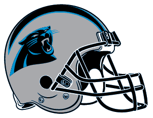
The problem with this logo is the panther is unartfully cut off at the shoulders. Also, the cat’s head is awkwardly turned toward the viewer, where a better solution would be to show it in profile or head-on. It’s time to refresh this one.
See our Stadium Footwear Favorites.
31. New Orleans Saints
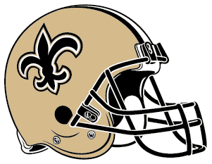
Fleur de Lis? Really? Webster’s tells us this is French for “flower of the lily.” Opponents are not trembling in fear.
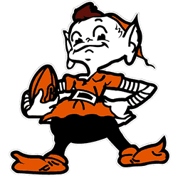
30. Cleveland Browns
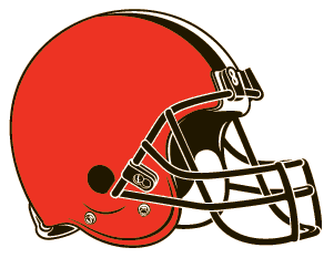
In logo design, simplicity rules. The Browns take this adage to its extreme. Their logo is no logo, or rather, orange, as in the color orange. We suggest a return to the impish “brownie” of the 1940s.
Explore our Inside the NFL’s practice squad system feature.
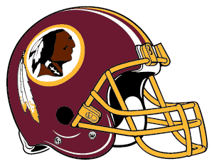
29. Washington Redskins
Beyond the problematic objectification of Native Americans, this design doesn’t make sense. The proud warrior and his two feathers are encased like a nesting doll within a circle, repeating an almost identical set of feathers.
The Redskins have changed to the Washington Commanders.
You might like: Bullied Boy’s University of Tennessee t-shirt design goes viral.
28. New England Patriots

Let’s be honest. The Patriots won six Super Bowls in 18 years despite their logo. The logo features a stone-faced man wearing a tricorn hat (some say he’s the doppelgänger of politician John Kerry). Here’s the problem: the forced swoosh lines are not believable. Let’s face it: the forefathers of our country were old white men wearing powdered wigs. They never moved that fast.
Check out Good Football Sayings.
Meh…
27. Arizona Cardinals
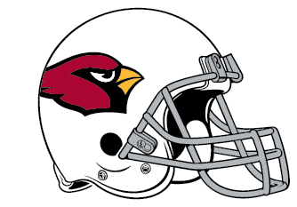
The Cardinal logo on Arizona’s helmets lacks personality and pizzazz. For more interesting examples, we prefer the Louisville Cardinals or baseball’s St. Louis Cardinals logos.
26. Detroit Lions
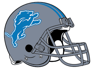
The lion on its hind legs harkens back to the look of medieval heraldry. But even after its 2017 update, the Lions logo is uninspiringly flat.
Not Bad
These logos are passable.
25. Miami Dolphins
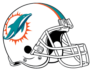
Miami updated its stodgy, jumping dolphin in 2013. The design is cleaned up (no more helmet) and is a quicker read—a nice modernization of the earlier logo.
24. Tennessee Titans
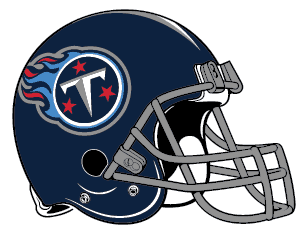
This logo is sometimes derogatively called “the flaming thumbtack.” That being said, the design is solid, and the colors work well. What would make this a better logo? A hulking, titan superhero is worthy of his own comic book.
23. Pittsburgh Steelers
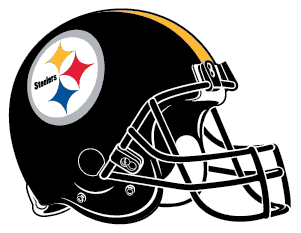
The corporate mark of the steel industry on one side of a football helmet seems odd. Especially since the logo was originally designed for U.S. Steel’s marketing purposes in 1960. But after more than 50 years of use, we no longer question its representation of the Steelers football team.
22. Baltimore Ravens
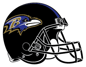
Edgar Allan Poe wrote The Raven and lived and worked in Baltimore. Finding inspiration for a football team that is more disparate than a 19th-century poem would be hard. Well done, Baltimore. Well done.
21. Jacksonville Jaguars
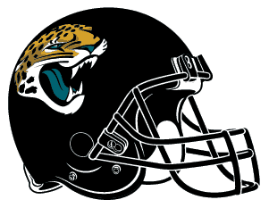
The Jags pull off the angry cat logo better than their fellow 1995 NFL expansion team, the Carolina Panthers. This is about as good as it gets for a realistically rendered logo of an angry cat.
20. Los Angeles Rams
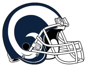
The swirling horns representing a bighorn sheep fit nicely on the Rams football helmet. They represent the brutal game as well as any logo. However, we prefer the yellow and blue combination of the 1980s, which was much more striking.
In Need of a Makeover
19. Tampa Bay Buccaneers
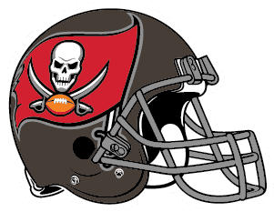
You can’t go wrong with a pirate’s menacing Jolly Roger flag featuring a grinning skull. But scale that flag down a bit. It’s too large for the helmet. Someone said, “Supersize it,” too soon.
Classics
18. New York Jets
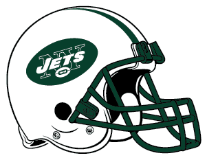
The Jets logo has remained largely unchanged since its first use in 1964. (Except for 1978-1997, when a more streamlined version appeared.) Its simplicity is appealing: J-E-T-S and a football. It worked then, and it works now.
17. Green Bay Packers
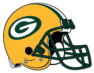
The Packers’ “G” is overly simple, somewhat dated, and not at all intimidating. But what will they do? Should they put Acme Packing Company on the helmet? So solid that the University of Georgia copied it.
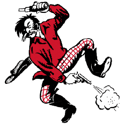
16. San Francisco 49ers
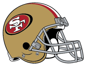
Like the Packers, the 49ers use their helmets’ initials to represent the team. Was the original logo of a handle-bar-mustachioed 49er firing his revolvers to celebrate a gold strike much more interesting and cool? Yes. Yes, it was.
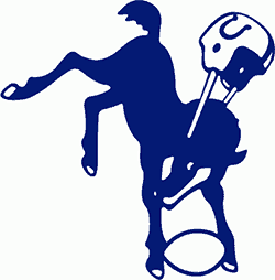
15. Indianapolis Colts
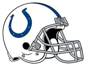
With his helmet flying off, the old bucking colt logo from the team’s days in Baltimore can’t be beaten, even if it is stylistically outdated. The horseshoe is the next best thing. Simple, classic, and iconic.
14. New York Giants
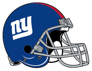
The Giants “NY” logo is strong and simple; it doesn’t try to do too much. The team was right to resurrect this classic look from its 1961-1974 seasons.
Hall of Fame Fantasy Football Team Names Video
Good NFL Logos
13. Atlanta Falcons
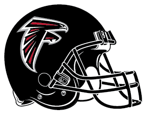
The Falcon logo on Atlanta’s helmets doesn’t look much like a real falcon. But it captures the spirit of a conquering raptor. And that’s all that matters.
12. Denver Broncos
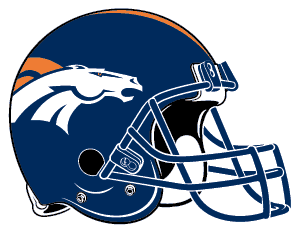
Denver updated their upright, snorting bronco logo from the 1970s and 80s, making it more streamlined and aggressive. With its mane flying, the horse’s head looks strong and fast, just like it should.
11. Philadelphia Eagles
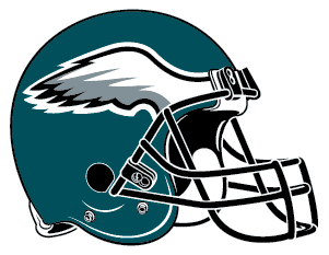
What better way to let the eagle soar than the perfectly placed wings on the Eagle’s helmet?
10. Minnesota Vikings
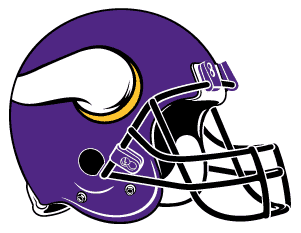
The horns on the Vikings’ helmet are supposed to look like three-dimensional horns protruding out. Even though the 3-D illusion is unconvincing, the resulting logo is a perfect size and shape for a football helmet, like the Nike swoosh.
9. Buffalo Bills
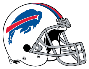
The buffalo charging with the single red swoosh line is perfect. Please don’t mess with it. This logo is a vast improvement over the older version, which shows a buffalo that seems to have just been shot with a tranquilizer dart.

8. Seattle Seahawks
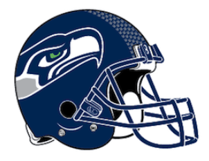
The Seahawks logo features a striking horizontal design that fits well on a football helmet with a stylistic nod to the native culture of the Seattle area.
The Best
Here are some of the best NFL logos.
7. Kansas City Chiefs
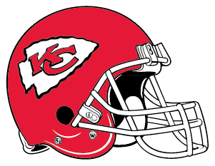
They say red represents action and courage. The white arrowhead design plays off the Chief’s red helmet and faces the opponent like 11 spears ready for battle.
6. Chicago Bears
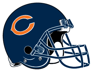
The Bears “C” hasn’t changed much since the early 1960s. It stands alone in its simplicity on a field of dark navy blue. Teamed up with burnt orange, it makes for a striking combination.
5. Oakland Raiders
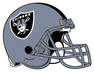
The Raiders score points for having a great logo and not messing with it over the years. Could it be modernized? Yes. Should it be modernized? No.
4. Houston Texans
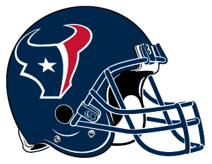
The Texans began in 1999 after Houston lost their hometown Oilers (another great team logo from the past) in 1996. The Texans logo captures the essence of the state: longhorn cattle and the lone star—an artful yet simple solution for a team from Texas.
3. Cincinnati Bengals
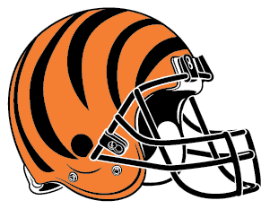
There are detractors to the full-helmet-design solution to branding a football team. We are not one of them. These cats look cool in their orange and black stripes.
2. Dallas Cowboys
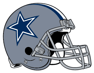
Dallas wins the award for the simplest logo in the NFL. Whoever got paid for this design should be arrested for stealing. But the truth is, someone had to claim ownership of the iconic star, and there is no better choice than the Dallas Cowboys from the Lone Star State.
1. Los Angeles Chargers
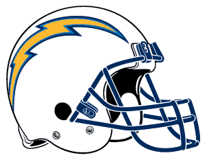
Lightning bolts arcing across the dome of the NFL helmet are just plain cool. Good choice, Chargers.
There you have it. All the NFL logos ranked from worst to first. It’s a tougher task than you think, as many of the selections are similar in style.
The NFL Logo
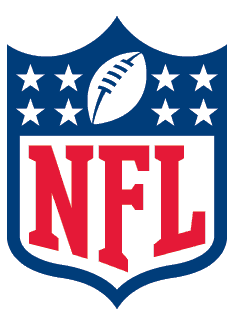
Sometimes referred to as the “NFL Shield,” the NFL logo is practical and functional amongst sports logos.
Wrapped in the colors of the American flag and with white reversed stars out of the blue, this design links the National Football League very tightly with the good, old U.S.A. And, with attendance and revenue figures supporting its claim as America’s #1 sport, the look seems very appropriate.
History of the NFL Logo
In 2019, the NFL will celebrate its 100th season. The current NFL logo was designed in 2008 by the NFL’s in-house marketing team. The first edition of the logo was adopted in 1941. The number of stars was reduced from 25 to 8 to arrive at the current version. The shield and typeface used were also modernized. The football depicted was also modernized.
The NFL was founded with 11 teams in 1920. Currently, the NFL fields 32 teams representing American regions, states, and cities. The logo’s design represents the prominence and prestige of this successful football league. The shield design lends credibility.
So, you may know how the NBA has “The Logo” modeled after Jerry West. Shouldn’t the NFL have a logo design with a silhouette of a player to complement The Shield? Who should the model for the NFL be? Jim Brown? Walter Payton? Dick Butkus? Tom Brady? I’ll leave you with that question and helmet logo rankings to ponder until the season begins.
Extra Points
You’re on our NFL Logo Rankings page. Originally published in April 2019.
You might like: